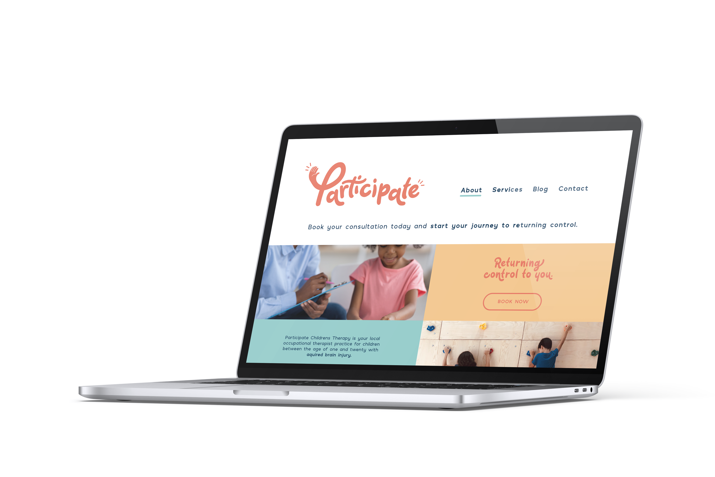
A frequent brand theme amongst Occupational Therapists is to use blunt san-serif fonts with some sort of icon. Basic and seen across the board . . . Participate is different.
This can create a cold and unfriendly feel which is where you can stand out by introducing a creative typeface with illustration.
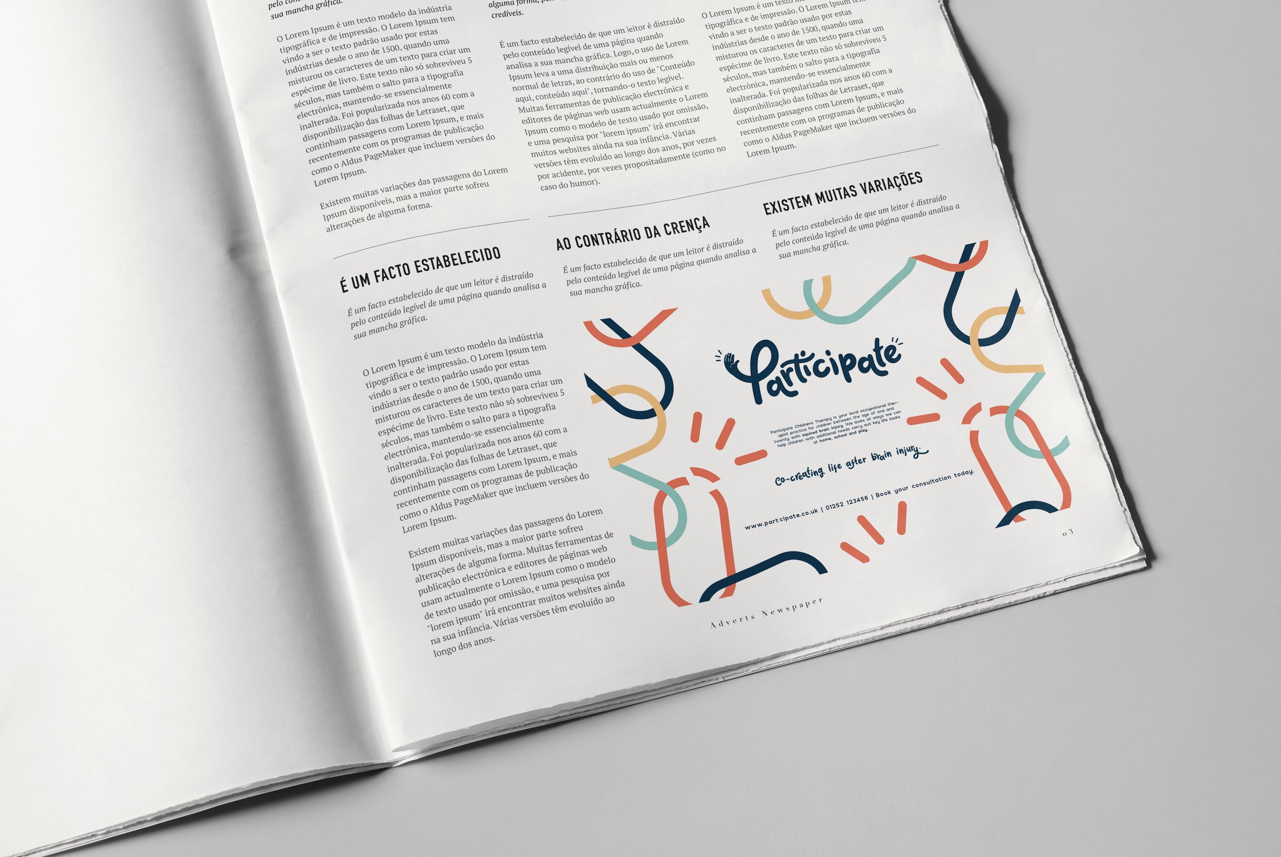
By using a playful, clean and scriptive typography you will create a fresh and inviting feel to your branding.
The use of hand illustrations (the high-five on the ‘P’) helps to convey the message that this is a participatory process involving the whole family.
The colours most commonly used within the industry are blue and green, eluding to a cold, sterilised and clinical feeling. Using a bright and zesty will allow you to stand out amongst your competition!