MOTHER EARTH - For the wellness-driven entrepreneur with heart.
A fresh and modern identity designed for those in the wellness space, from holistic coaches to conscious brands. Organic yet strong, it blends soft, natural textures with an expressive mix of sans-serif and script typography. With earthy hues and an inviting feel, this brand embodies balance, wellbeing, and authenticity.


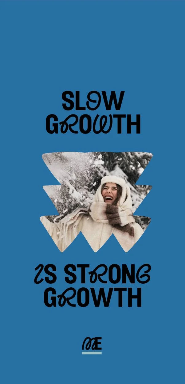
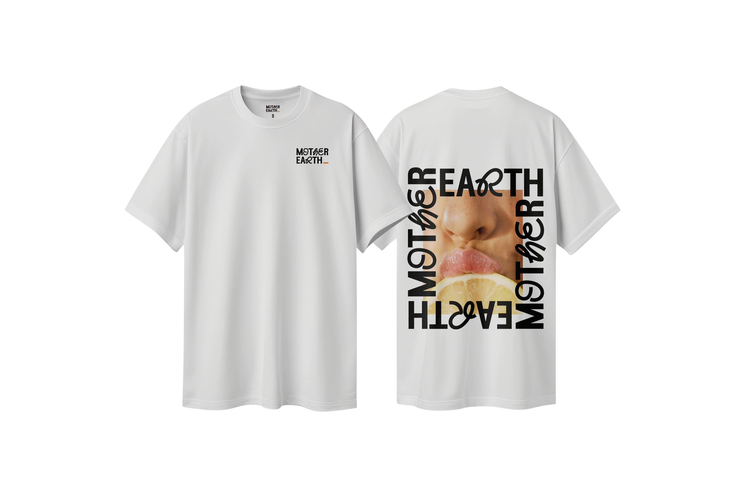

Mother Earth:
Tone of Voice: Warm, authentic, knowledgeable, and nurturing, yet still forward-thinking. This brand speaks to an audience that values wellness, sustainability, and conscious living—without being overly delicate or passive.
Aesthetic: A refreshing yet modern identity with a strong connection to nature and wellbeing. The color palette is rooted in soft, organic tones that balance warmth and freshness. "ED Nimpkish Regular" brings character with its unique blend of sans-serif and script—offering a fluid, handcrafted feel while maintaining modern legibility.
Imagery: Softer and more organic compared to "HERE SHE IS." Think natural textures, raw moments, and a balance of light and shadow that evoke a feeling of wellness and renewal. Visuals should feel intentional yet unfiltered—whether it’s earthy lifestyle shots, product photography, or storytelling images.
Patterns & Graphics: Gentle curves, flowing lines, and natural elements. Patterns feel fluid and grounding, rather than overly structured or geometric.
Best suited for: Wellness coaches, nutritionists, holistic therapists, eco-conscious brands, or anyone with a heart-led business that promotes balance and wellbeing.


-
Explore my collection of striking, personality-packed brand identities and find the one that feels like the perfect fit for your business. Every brand is customisable—colours, logos, taglines, and imagery can be tailored to reflect your unique style.
Here’s how it works:
Limited Edition: Each brand is available to just 3 businesses, ensuring exclusivity.
Want It All to Yourself? Upgrade to full ownership and make it 100% yours.
-
GROUND FLOOR
What’s Included:
5x Instagram Post Templates: Ready-to-edit templates with a stylish, cohesive design that aligns with your brand’s aesthetic from The Brand Vault.
5x Instagram Story Templates: Eye-catching story templates that allow for seamless sharing and engagement with your followers.
5x Instagram Reel Templates: Fun and dynamic reel templates, formatted and ready to stand out on the feed.
Perfect for clients who need a quick, cost-effective branding solution with professionally designed templates that are easy to use and adapt for their business.
Pricing:
💸 £549LEVEL UP
What’s Included:
10x Instagram Post Templates: Fully customisable templates that reflect your brand’s personality, perfect for posts that capture attention and drive engagement.
5x Instagram Story Templates: Story templates with a seamless design and messaging flow to keep your audience engaged and connected.
5x Instagram Reel Templates: Dynamic, fun, and editable reel templates that align with your brand identity and help you showcase your products, services, or personality.
Canva Setup for Client: I’ll set up your Canva account with everything in its place—templates, fonts, colour palettes, and other brand assets—so you’re ready to go from day one without any extra hassle.
This package is perfect for entrepreneurs who want a fully organised, customisable template library in Canva and need a smooth, efficient process to create consistent, professional social media content with minimal effort.
Pricing:
💸 £999INTENSIVE DEEP DIVE DAY
from 11am-2:30pm
💸 £250
REFRESH ME
I offer updates to refresh your look and keep your branding fresh and engaging for your clients.
from 💸 £250
-
1. Customisation of Mother Earth
Change the name...
Obviously, you’re not going to want to be called "Mother Earth." This is simply a placeholder for showcasing the brand! You can easily change the name to suit your business, and we can also adjust the colours to better fit your vibe. Want to swap out the brand illustrations and patterns? No problem—these can be customised too!The typeface has been carefully chosen to complement this template’s vibe and is fixed, but if you love the overall look of the template and not the font, don’t worry! We can explore other typeface options that align with your brand. Feel free to insert your unique tagline, and we’ll make sure everything aligns perfectly.
2. File Formats and Compatibility
Which file formats will I receive?
All templates come in an organised file containing the following formats:PNG (transparency)
EPS (transparency)
SVG (transparency)
PDF
These file formats ensure you can easily use and scale your branding across different platforms and media—whether you’re posting on social media or printing materials.
3. How to Use Canva
Do I need Canva Pro?
I highly recommend upgrading to Canva Pro! With Canva Pro, you'll be able to upload custom fonts (like the one used in this template) and access a ton of extra features that’ll make your branding pop. From premium stock photos to enhanced design capabilities, Canva Pro is an excellent tool for entrepreneurs who want to create professional, polished content quickly.4. Template Updates
Can I request future updates?
Absolutely! As your business evolves, so can your brand templates. I offer updates to refresh your look and keep your branding fresh and engaging for your clients. Keeping your visuals updated and dynamic helps maintain the excitement and confidence in your brand. If you need any updates or modifications, just reach out, and we can discuss options!5. Support & Guidance
I’m here to support you!
If you have any questions about customising your templates or using Canva, I’m here to help. I offer an Intensive Branding Day from 11am-2:30pm for £250, where we’ll deep dive into your brand and get everything set up so you can confidently use and maximise your templates. This is a great opportunity to ensure everything is aligned with your vision, and you’re confident using your templates in real life.6. Time Investment & Efficiency
How long will it take to implement?
With the Premium Package, you’ll have everything set up and ready to go in Canva, saving you time and stress. You’ll be able to start posting and engaging with your audience right away, all while maintaining a consistent, professional look across your social media. Whether you need a quick refresh or want to dive deeper into your brand, everything is pre-organised, so you can jump in and start creating content without delay!